Article · Seismic AI
Why Does AI Keep Missing S-Waves?
Seismometers record around the clock. In a single year, Taiwan logs tens of thousands of ground motions. Picking out which of those are earthquakes — and the exact moment each one arrives — was traditionally done by hand: an analyst reading waveform after waveform, marking them one by one. A seasoned analyst does this well, but the volume is overwhelming, and analysts are human. They need sleep.
So over the past few years, seismologists handed the job to deep learning. Once a model is trained, you feed it a stretch of waveform and it tells you the moment a P-wave arrives and the moment an S-wave arrives.
P-waves and S-waves are two types of seismic wave. The P-wave is fast and arrives first. The S-wave is slower and arrives later, but it carries more destructive energy — it's what you feel most when a building shakes. Where the earthquake is and how severe it is depend on both of these arrival times. Neither can be missed.
A baffling failure mode
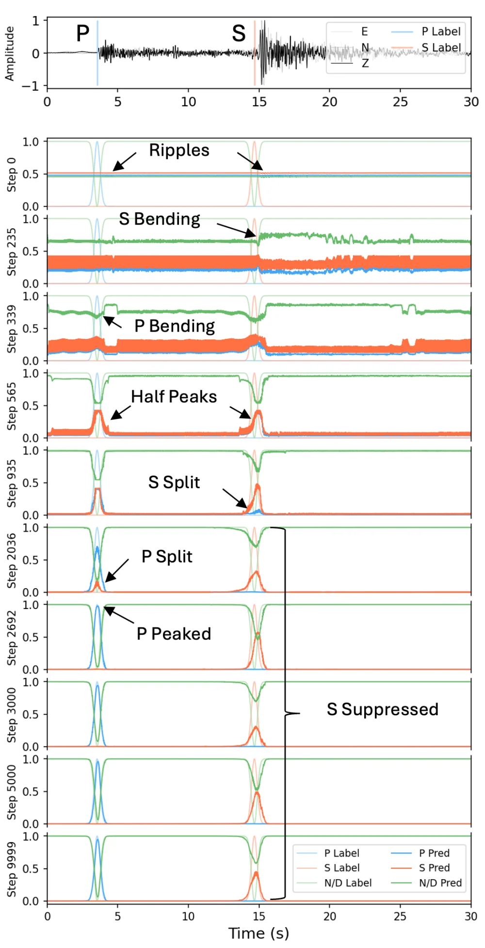
The problem is that when the AI picks P-waves it behaves like a perfectionist, yet it keeps fumbling the S-waves. On the very same waveform — where the S-wave's location is obvious to a human — the model produces a lopsided, stunted little peak that lands just below our detection threshold, and so it gets counted as a miss.
Stranger still, the location it sees is usually correct. The timing is right; it's the height that falls short.
Seismologists have known about this for years. The usual response is to reach for a bigger model, feed it more data, or tweak the training recipe — treating it as an annoying side effect to be worked around.
This paper didn't try to work around it. The authors wanted to understand exactly why it happens.
Why it gets stuck
Imagine you're judging how closely a portrait resembles its subject. The intuitive way is to look at the whole face. But suppose the rules change: you're not allowed to view the whole image, only to chop it into hundreds of little cells, score each cell independently, and add up the scores. Now you're in trouble.
Each cell can only tell you whether it should be brighter or darker. No single cell can tell you the whole face should shift a little to the left. So when the predicted shape is correct but its position is nudged slightly to the right, every cell receives the same signal — you're not bright enough, tone yourself down. The prediction grows fainter and fainter, but its position is never corrected.
The conventional way of training an AI to find S-waves is exactly this kind of per-cell scoring. It has no mechanism to tell the model which way to shift as a whole — only to dial brightness up or down. So the S-wave prediction stalls at some position, neither here nor there, flattening itself ever thinner.
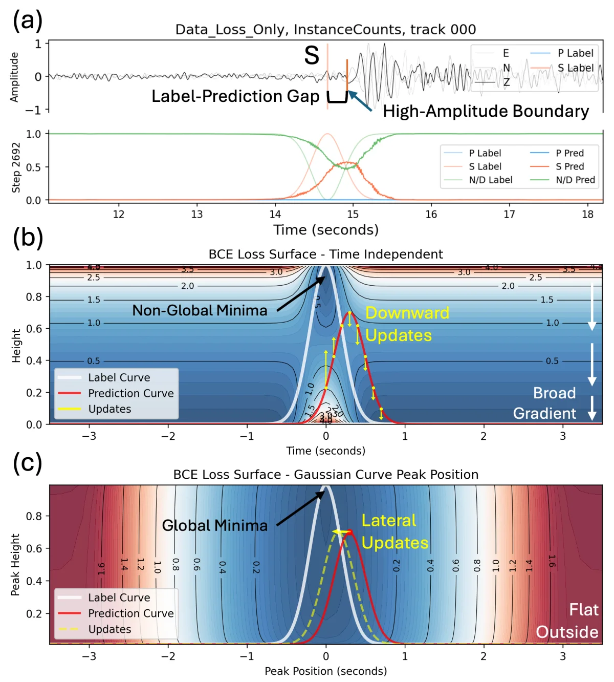
S-waves are especially prone to this, and two further things pour fuel on the fire. First, their ground truth is inherently fuzzier: after travelling far, an S-wave broadens and its edges blur, and even human experts disagree on the exact pick by a few hundred milliseconds — so the "correct answer" in the training data is already noisy. Second, AI models are naturally drawn to sharp features, and they tend to anchor the prediction to the most prominent kink in the waveform — which happens not to be where the S-wave belongs.
The three factors together trap the S-wave prediction in a corner with no way out.
The fix
With the diagnosis in hand, the fix follows naturally.
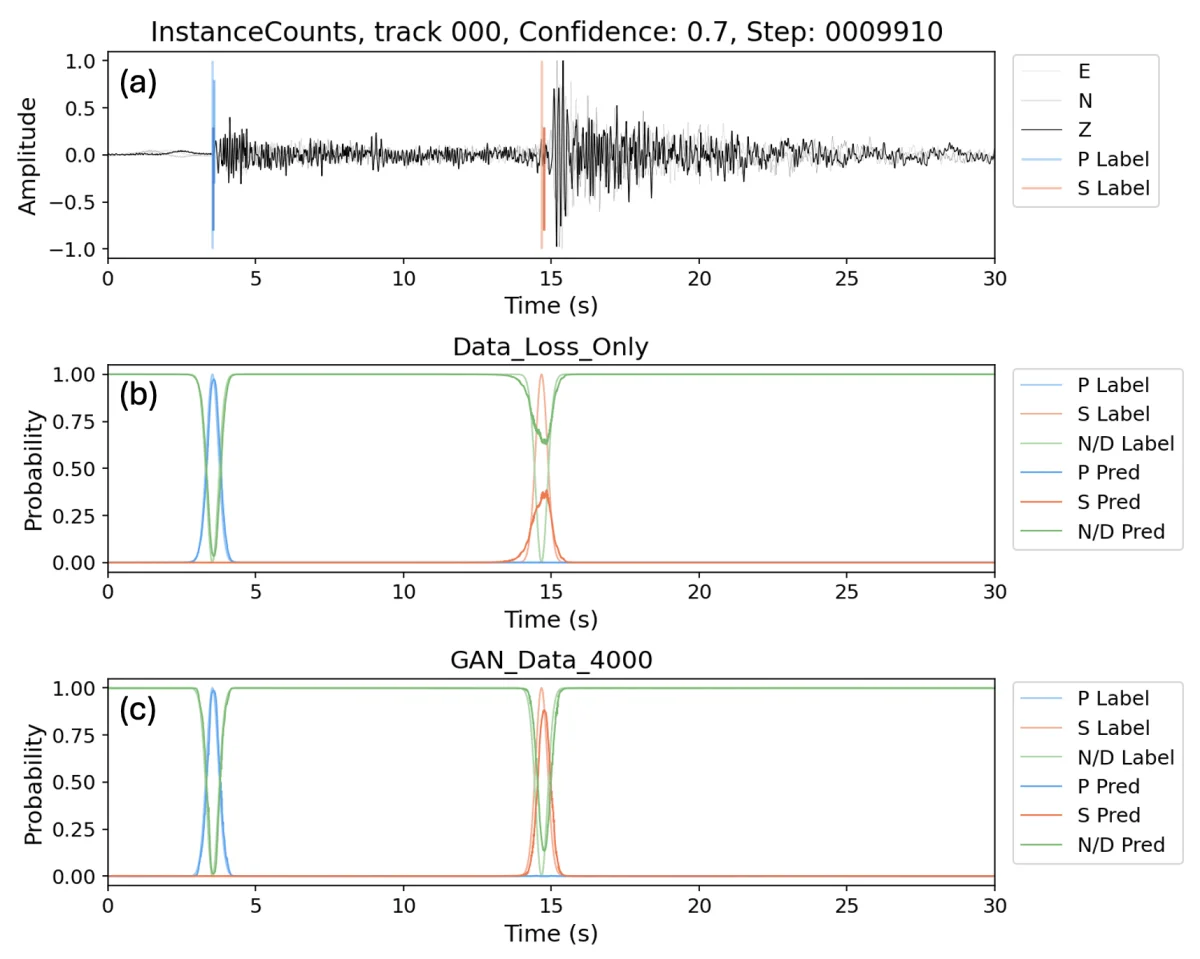
The authors turned to a technique called a GAN. GANs are usually used to generate fake photos or videos: the idea is to pit two models against each other, one producing and one criticizing. The producer tries to fool the critic; the critic tries to tell real from fake; and in the end the producer is pushed to look more and more genuine.
In this paper, the critic — the discriminator — has one job: glance at the model's output and judge whether its overall shape looks like a real label. It doesn't care about each cell's individual value; it looks at the whole face.
That fills in the signal that was missing all along. The model can no longer just get each cell's brightness right; it has to make the whole face hold together, or the discriminator catches it at a glance.
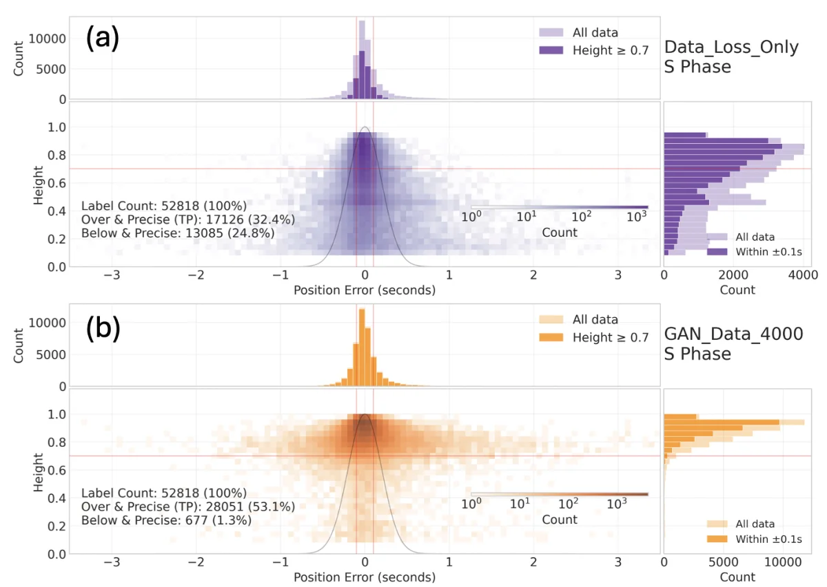
Why this matters more than the 64%
64% is a lovely number, but it isn't what makes this paper genuinely interesting.
What it really achieves is taking a phenomenon that was treated as an engineering nuisance and breaking it down into something that can be understood, predicted, and analyzed. Why it gets stuck, where it gets stuck, and how to release it — all of it can be spelled out. The whole process moves from trial-and-error to principled analysis.
This diagnosis isn't limited to earthquakes. It applies to any task that marks a moment in time within a signal: a heartbeat in an ECG, an event in a satellite signal, a syllable boundary in speech. Whenever the ground truth is something with a shape, conventional point-by-point scoring can drop you into the same trap.
The paper ends on an idea: understanding the shape of the loss function itself matters no less than understanding the model architecture. We're used to debating which network to swap in, how many layers to add, which activation to use — but rarely does anyone stop to ask whether the objective we're telling the model to optimize has the right shape in the first place.
Get the scoring rule wrong, and even the most powerful model is wasted.
Reference
Huang, C.-M., Chang, L.-H., Chang, I.-H., Lee, A.-S., & Kuo-Chen, H. (2025). Recovering Sub-threshold S-wave Arrivals in Deep Learning Phase Pickers via Shape-Aware Loss. arXiv preprint, arXiv:2511.06731.
arxiv.org/abs/2511.06731
ResearchGate
Code: github.com/SeisBlue/BlueDisc
Appendix: training animation
An animated version of the first figure in this article. As training progresses, you can watch the S-wave prediction get pushed down below the detection threshold.